

jfmuk
-
Posts
2 -
Joined
-
Last visited
Content Type
Profiles
Forums
Events
Posts posted by jfmuk
-
-
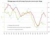
Pretty sure that someone has already produced a similar chart, but this is my analysis of the market. Can't see mortgage approvals increasing anytime soon.

Post Your Favourite Charts Here
in House prices and the economy
Posted
One of the previous charts that I have uploaded to this thread highlighted the link between mortgage approvals and the yr-on-yr change in house prices (post no. 620).
Looking at this chart again I noticed that the rate of decline in yr-on-yr growth for the four periods that we have seen since 2000 (including the one that we're experiencing now) were similar. Plotting these highs and lows in year-on-year growth confirmed this view and suggested that by June 2011 the average price might be 10% lower than that of June 2010.
Below is the chart from post 620 followed by the comparision of declining growth periods: